D-Web Layout & Color Settings Overview
The D-Web Layout & Color settings allow you to further change the look and feel of your site beyond just adding a Header or Footer image. We have included over 85 setting controls to give you as much flexibility as possible in setting your sites design, look and feel.
Some things you cannot do that you need to remember:
- You can not change the basic page layout, which is set into 3 main areas on your page:

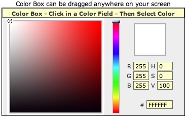
To change a color the Layout and Color Settings page comes with a Color Tool Box

You can move the color tool box anywhere on your screen and
this is helpful when you are woring on the Footer section at the bottom of the page.
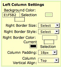
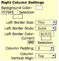
To change a color click in the color field (1) next to the field name and then within the color toolbox select the color you want in the color toolbox itself. The box just to the right of the color field (2) will display your selection from the colortool box. To confirm this seletion click the update button at the bottom of the page. The Selection box
(3) displays the current setting for your site. You can also cut & paste a color code into any other color field.

Menus
Startng with D-Web Version 2 you can now change the colors of your menu at any time.

You can change
Fonts used - the Font size and the Menu Border on a global basis meaning that these settings options apply to all menus.
Individually depending on they menu status:
Although these settings are limited you can now more readily adapt them to your sites look & feel than in previous versions of D-Web.
Header Area

In the Header area you would place your web sites standard graphic header image usually incorporating your Colors - Logo & Name.
Generally we recommend the Header image should be 900 pixels x 150 pixels Max although the D-Web settings will proportionally increase or
decrease this to fit within the page width size that you can set now for your site.
These are not steadfast rules but are only guidelines. The nice thing about the D-Web application is that you can experiment to find the look you like.
You can set the following Display and Color Settings for the Header Area:
Because of the way your site is displayed and to also help remove the possibility of distorting your sites look no text can be placed n the Header area so what ever design you want to use shud include what ever text you want to show in this area also.
Footer Area

The Footer image should complement your header image in terms of color and dsesign styling. Generally the Footer image should be the same width as the Header image, but between 50-150 pixels in height. The Footer image will repeat from left to right and fill the footer area. In the web page list you can add text, such as your copyright information to the footer area.
Use the Footer height setting to increase the footer area to accommodate what ever text you want to display here.
Again there are no steadfast rules it will depend on what you like. The nice thing about the D-Web application is that you can experiment to find the look you like.
You can set the following Display and Color Settings for the Footer Area:
Content Area
This is the main page display area for your site. It is divided into 3 sections:
Left Column

Your sites page Menus are displayed here which are dynamically generated each time you create an Active page.
You can also display other information below the Main Menu by editing the Left Column Page in your Web Pages list.
You can set the following Display and Color Settings for the Left Column:
Center Column

The Center column of the Main Content Area is where the meat of your sites content is displayed and takes up the most space on your web page.
- You can set the following Display and Color Settings for the Center Column:
Right Column

Your sites News Bar is displayed in the Right Column.
You can set the following Display and Color Settings for the Right Column:
D-Web Page Editing – Layout & Color Settings Tips
- Never edit more than one page at a time or you may lose all the pages content you have added.
- Never Delete the Home page - Footer or Left Column page in the Web Page Listings if you do this will mean that no information will show when a user goes directly to your URL i.e. http://yourdomain.com although your other page menus will still show and work along with the pages design and layout.
- If you have trouble with sentences within your page stretching out across the screen, create a table and paste the text into the table then adjust the table size.
- To enhance search engine ranking (although this by no mean will guarantee you a high ranking) use important words often and also highlight words by making them bold. Use Heading formatting to break your page up. Also don’t forget to add Meta Tag keywords & Meta Tag description to each page.
- You can hide the News bar on any page by edit the page you do not want it to show on – click NO for Show News on this page option.
- You can hide the text below your main menusin the left column area by deleting the infrmation from the left Column page in the Web Page Listings
- To control the width of your page within the browser window better set the page width using percentages instead of Pixels 100% will fill the screen and a setting of 80% will leave a border on either side depending on what your background is.
- To control or set the overall page borders set Global Page Bordersettings, the Header Borders for the Top - Left -Right sides - Set the Footer Borders for the Bottom - Left & Right Sides
- Global Page border settings only affect the left and right borders of the overall content area itself.
- A clean design is a better design – don’t be afraid of using the color white a column background colors
- Borders such as ridge – Dotted – Inset require a larger width setting in order to be seen sometimes
- For Header Background colors remember that these colors will show through an image that has transparency section within it – usually only on Gif or PNG type files
- If you are using rounded corners in your header areas and the rounded edges appear ragged try adding the page background color or design as the file background within the image – rounded corners tend to look better when created this way and saved from within the Graphics program being used to generate the final file.
- Standard Jpeg images have no transparency to them
- The font Verdana is the best font to use, as it is the easiest to read on the screen.
|
